
- Maciel Printing
- Novato/San Francisco, CA
Industries
- E-Commerce
- Design
- Marketing & Advertising
- Print Services
Design Categories
- Branding
- Icons/Illustration
- Large Format
- Print Production
- Templates
- Web/UI Design (No-Code)
Tools
- Adobe Illustrator
- Adobe InDesign
- Adobe Photoshop
- Photography
- Xerox Color 1000i Digital Press
- HP Scitex FB550
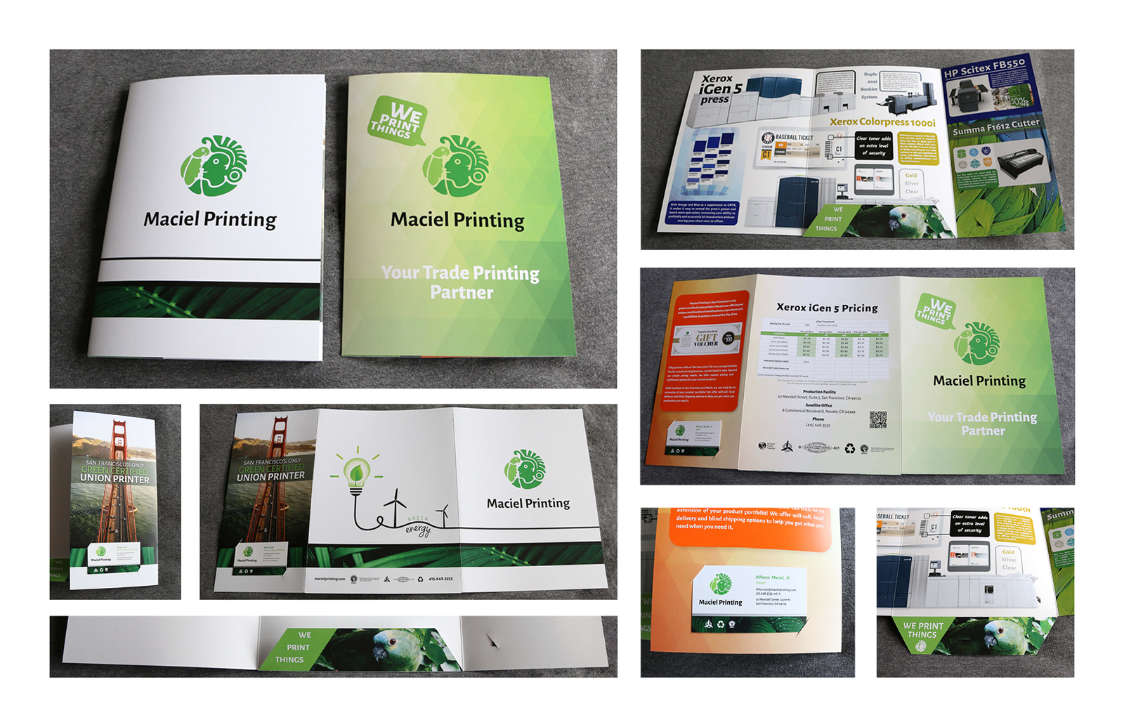
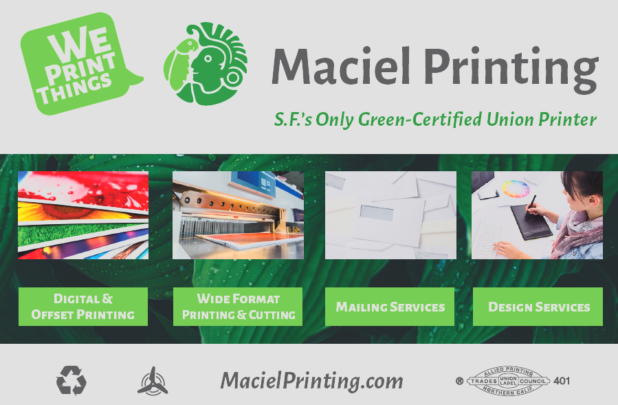
Maciel Printing operated out of San Francisco, CA, providing a wide range of printing and production services.
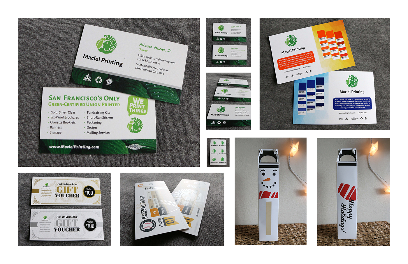
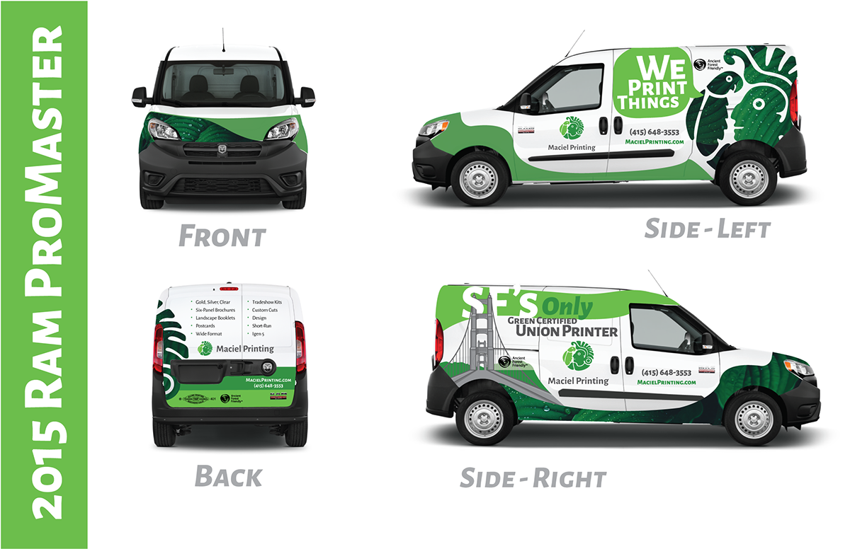
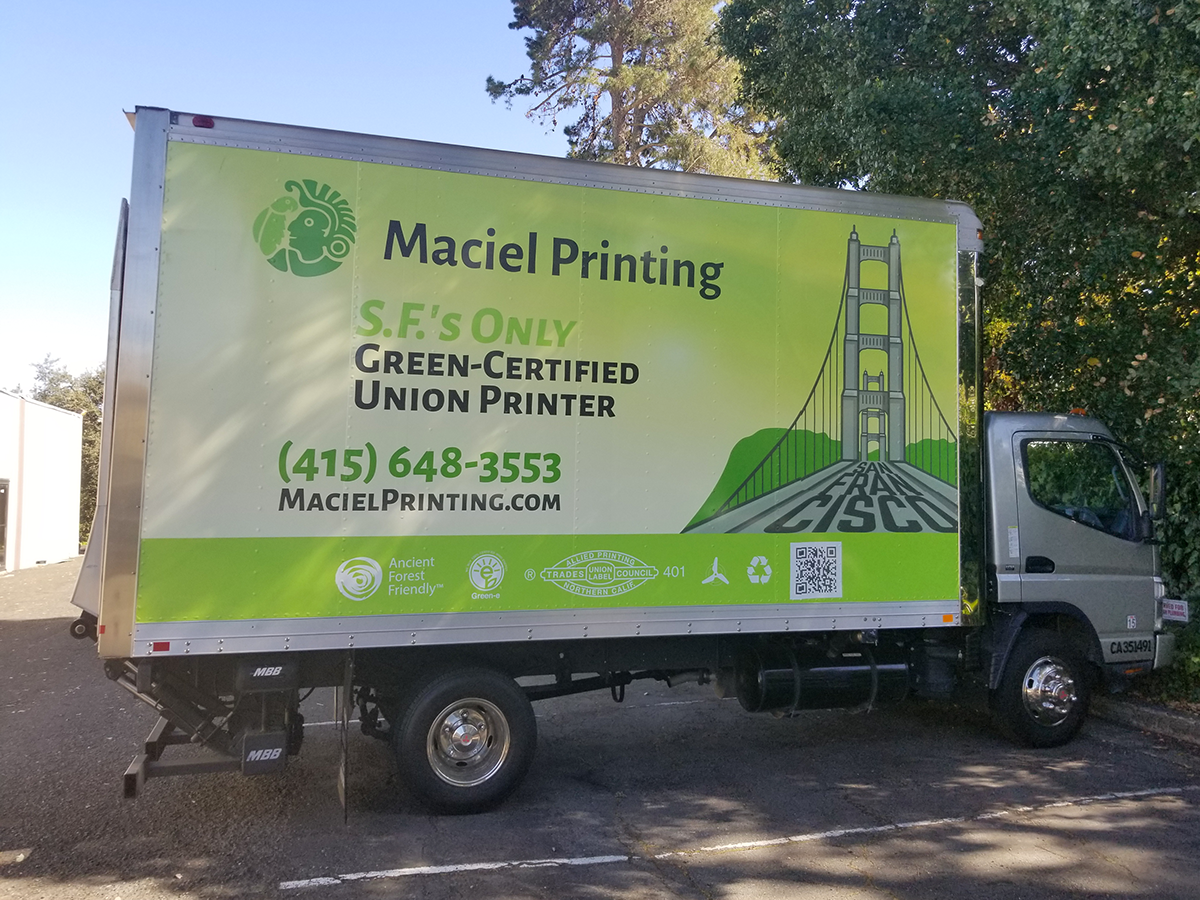
For over 25 years, they served non-profits, businesses, schools, community groups, and government agencies, delivering high-quality prints from simple black-and-white short runs to large-format, multi-color projects. They were ready to take their business to the next level when I joined the team, and I had the privilege of guiding their rebranding journey. From designing a modern logo and brand book to creating impactful print collateral and a dynamic website layout, I worked to bring their vision to life.
Then and Now
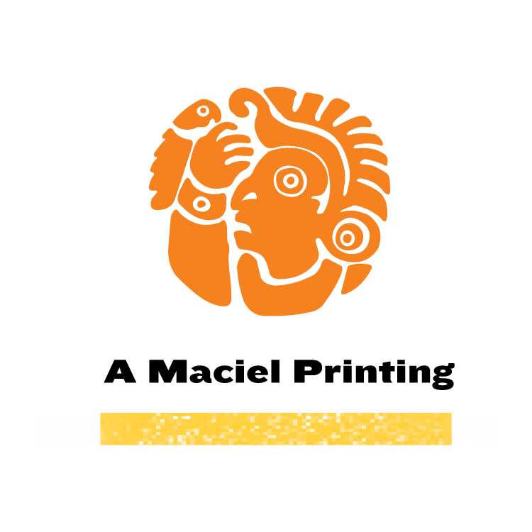

When I first saw Maciel’s logo, I noticed it needed several updates—particularly in scaling, color, modernization, and simplification.

I began by refining the lines and negative space, focusing on the interaction between the bird and the man. The original expression felt disgruntled or shocked, so I aimed for a friendlier look while keeping the essence of the icon. I appreciated the historical significance of the Mayan-inspired design, chosen by Maciel’s original owner, and wanted to honor that.
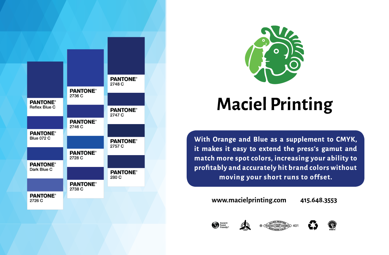
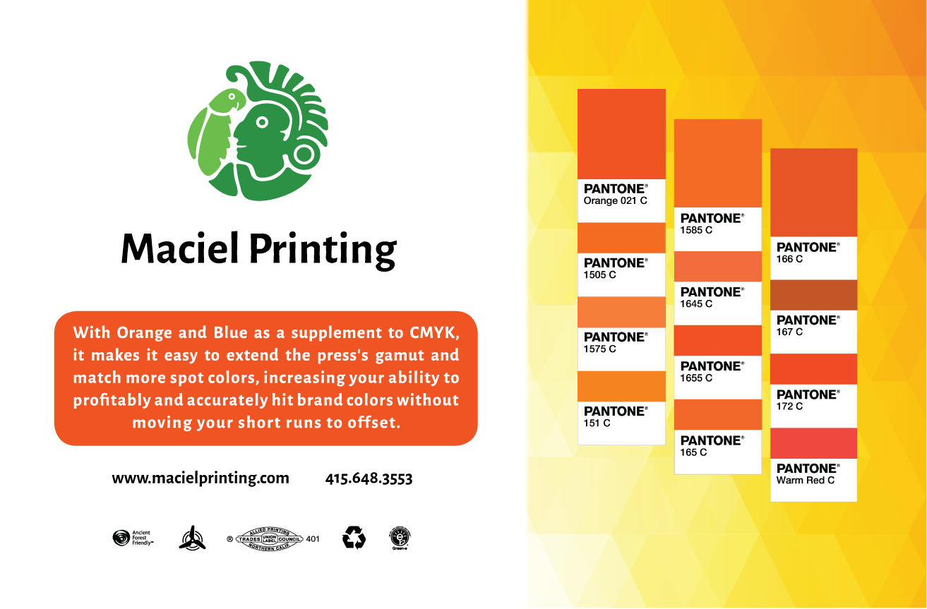
While exploring other concepts, I experimented with adding a subtle leaf shape (bottom right in green) which doubled as the parrot’s tail. I shifted the color palette from orange to green to reflect Maciel’s status as San Francisco’s only green-certified union printer. Green reflected their commitment to sustainability and also brought a friendlier, more inviting feel to the brand. The leaf-shaped logo was my personal favorite, but we ended up moving forward with a more unified, circular shape as seen above.
Website Redesign


1
Full Rebrand
50
Custom Icons & Graphics Created
6
Website Pages Redesigned
Additional Assets


This project was a unique blend of creative exploration and practical application, where I not only honed my branding skills but also gained hands-on experience with the intricate stages of printing and production. Though the company has since closed, the work remains a standout example of my dedication to thoughtful and cohesive design.